For the past year, I’ve had the pleasure to work on and off for a Toronto-based consultancy that focuses on accessibility. In addition to doing training, accessibilty audits, and development, they provide video captioning and description services, which is where I fit in.
Unlike those mysterious beings that close caption live television, I caption videos – generally university lectures. It’s interesting work, and was a lovely part-time job while I was finishing up my Masters. I’ve kept up with it because I enjoy it… and extra pocket money is always enjoyable. What I did not realize when I started, however, was that it would also have a lasting (positive) impact on my work as an IA/tech writer.
You know how sometimes, you’re reading, and a line break hits in the wrong spot, and it’s weird? Bad sentence parsing. I usually only notice if it’s two or three lines of text, like a PowerPoint title, or subtitles on a video. Poor sentence parsing makes it harder for readers to read smoothly: in captioning in particular, you want people to be able to read quickly and glean all the information they’re reading without becoming confused by a subject-object split. As a person whose focus is on expressing concepts clearly, this has been something of a revelation. While I’m not a designer, I necessarily do some design in my work, particularly since I’ve started freelancing. Parsing is something that I increasingly think about, and I think it’s making my visual work easier to understand.
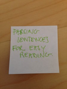
Take, for example, the post-it note that I have had stuck to my monitor, reminding me to write this post:
 That’s pretty solid. I’m happy with that parsing. I might easily have written this, though:
Parsing Sentences for
Easy Reading
Hopefully you see that this is a less smooth reading experience. Let’s take another example, this time borrowed from a fantastic Girl Geeks Toronto event that I went to last night (recap post to follow). The title of the event was “Designing for Digital: Processes and Planning for Powerful Solutions.” Here are two ways we could write that on the title slide of our presentation deck:
Designing for
Digital: Processes
and Planning
for Powerful Solutions
Designing for Digital:
Processes and Planning
for Powerful Solutions
I think the second one is easier to parse, and easier to read. With presentation software and design software, where you create text boxes and write in them, it’s easy to rely on the automatic text wrapping. I have started to fight that urge, and to think about how best to manage my line breaks. I’m not advocating for manually line breaking everything, but for titles or short, punchy sentences, it’s something to think about. If reading it aloud sounds wonky, try moving the line break. Your readers will thank you, even if they don’t realize it.
Edited to add:
Another excellent example care of Paul, from a Zipcar ad in the New York subway:
I spent a good two minutes trying to figure out what “in car sharing” might mean: pic.twitter.com/14DC9hbXoL
— Paul Reinheimer (@preinheimer) May 15, 2013